
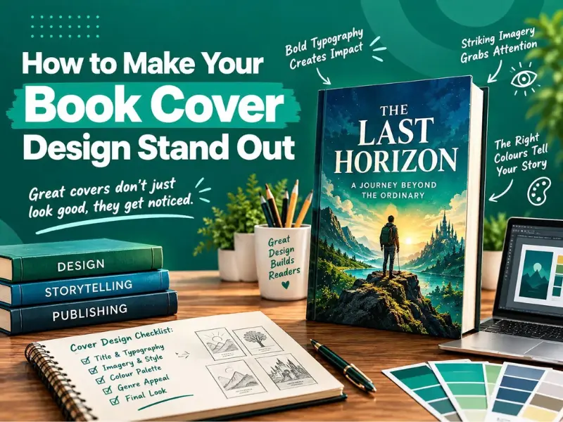
How to Make Your Book Cover Design Stand Out
A book cover has only a short time to make an impression. The design needs to communicate something about the book when a reader sees it on a bookshop shelf or an online marketplace before reading a single page.
That does not mean a successful cover has to be complicated. In many cases, the strongest designs rely on a clear concept, appropriate typography, thoughtful imagery and a visual style that suits the book. The challenge is knowing which elements deserve attention and which ones can be left out.
Keep reading to unlock all the secrets for creating a book cover that looks great from a distance!
Book Cover Design Guide – What You Need to Know
Your book is surely going to be judged by its cover, and this is why it is extremely important to create a strong first impression.
Here is how you can do it the right way.
Start With the Book’s Genre
Readers often develop expectations about different genres. A crime novel, romance book, children’s story and business guide can all use very different visual approaches.
A cover does not have to follow every convention within a genre, but it should give readers some idea of what they are picking up.
Professional book cover design services suggest that:
- A romantic novel might use softer imagery and elegant lettering
- A thriller could rely on darker colours, striking contrast and a more restrained layout.
The key is to understand the genre before trying to make the design unusual. A cover that looks completely different from its category may attract attention but confuse the intended audience.
Choose One Strong Visual Idea
Trying to include every important element from the book can make a cover difficult to understand at a glance. A better approach is often to identify one image and concept that represents the central idea.
For example,
- A mystery novel might use a partially opened door rather than showing several characters and locations.
- A cookbook could focus on one carefully photographed dish instead of filling the cover with multiple food images.
One strong visual idea gives the design a clear focal point and makes it easier for the reader to understand where to look first.
Make the Title Easy to Read
Typography is one of the most important parts of book cover design because the title needs to remain readable at different sizes.
This matters particularly for ebooks and online listings, where a cover may initially appear as a small thumbnail. Very thin lettering with decorative fonts or insufficient contrast can make the title difficult to recognise.
Authors should consider how the title looks against the background rather than choosing a typeface simply because it looks attractive on its own. The title should remain clear from a distance, on a phone screen, and as part of a small online product image.
Give the Author’s Name the Right Amount of Attention
The author’s name also needs careful consideration.
- The name may be an important selling point and deserve prominent placement for an established author.
- The title may need to take visual priority for a first-time writer.
This does not mean there is one correct layout. The appropriate balance depends on the book, the author’s existing audience and the publishing context.
A well-organised cover creates a clear visual hierarchy, allowing readers to understand the title, author and other important information without having to search around the design.
Think About the Thumbnail
A cover should be tested at the size readers are likely to see online.
An intricate design that looks impressive when enlarged may lose its impact when reduced to a small thumbnail.
One useful test is to step back from the design and view it at a significantly smaller size. The cover is more likely to work across different formats if the title, main image and overall concept are still recognisable.
You can also choose to take help from book layout design services to ensure your cover design meets the print and digital publishing standards.
Use Colour With a Purpose
Colour can influence the mood of a cover before the reader knows anything about the story.
- Deep reds and blacks might create a sense of danger
- Lighter colours can suggest humour and warmth
But using too many colours can make the cover look disconnected.
A limited palette can often create a stronger identity. One dominant colour combined with one or two supporting shades may be enough to make the important elements stand out.
You need to make sure that your colour works with the typography and imagery, as a visually attractive palette is not useful if the title disappears into the background.
Avoid Trying to Say Too Much
Authors sometimes want their covers to communicate the setting, characters, plot, genre, themes and mood all at once.
Your cover does not need to explain the entire book, as its primary purpose is to create interest and give the reader enough information to want to discover more.
Make sure to
- Remove all the unnecessary images
- Shorten the subtitles
- Reduce the number of decorative elements
This easily allows you to eliminate a crowded design with no obvious focal point.
Questions Authors Often Ask
- How early should an author start thinking about the cover?
The planning for your cover should begin when it is being prepared for publication instead of rushing things right before the release date. This offers you enough time to discuss design concepts, revisions, formatting, and conduct final checks.
- Should an author design their own book cover?
Authors with proper design experience can certainly create their own covers, but hiring someone with professional design knowledge can be extremely useful when your book needs to work across different formats and publishing platforms.
- Does the back cover need to match the front cover?
It does not need to be identical, but maintaining some visual connection usually creates a more cohesive finished book. Consistent colour and design elements can help the front, spine and back feel like they are parts of the same publication.
Wrapping Up
A standout book cover does not mean something that is full of unusual artwork and elaborate details. What matters is how effectively the individual elements work together.
A clear genre direction, strong focal point, readable typography, purposeful colour and appropriate imagery can give a cover a unique identity without making it unnecessarily complicated. When those choices are also tested across print and digital formats, the finished design has a better chance of attracting attention wherever readers encounter it!

Chloe Cather studied English Literature at Cardiff University and has extensive experience in publishing, with a strong background in editorial management and marketing. Chloe joined British Book Publishers in 2012, initially as Publishing Manager, and with strong experience in both publishing and writing, Chloe has become a respected voice on topics including publishing trends, book marketing, children’s literature, and poetry. Her work has appeared in articles, blogs, and industry discussions that help authors understand the journey from concept to published work while offering practical insights rooted in her own professional story. Chloe combines her creative writing skills with marketing knowledge to support authors and help their work reach the right audience.